Three views of the Moon
The skies were finally clear enough for astronomy last night, but with the Moon almost full, it was too bright to do any observing or tripod-based astrophotography of anything but the Moon (or Jupiter, which was up later, but by then the skies were hazy). So I photographed the Moon again. But this time I tried a few new things with my lunar photos.
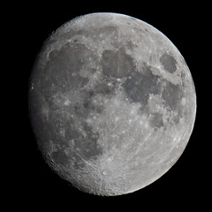
For one thing, I increased the image’s sharpness. This is apparently considered essential in lunar photography: it really draws out the Moon’s topography. In Photoshop the tool to use would be Unsharp Mask, and when I was farting around in Photoshop CS4 yesterday (the way I learn things), I tried this out on some of my old lunar photos. But in the end I made use of the Definition slider in Aperture, which achieves similar results. The final image (top right), with Definition set to maximum, is indeed a good deal sharper than the original, without too much contrast or too many artifacts.
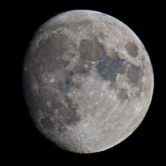
Once work on that photo was complete, I produced two variants, each of which with only one setting changed. In the second image (middle right), I pumped up the saturation — or rather, I maxed out the Vibrancy slider in Aperture. Vibrancy has been described as Aperture’s “smart saturation.” The end result is similar to my photo of March 9 (which also made use of Vibrancy), enhancing the Moon’s subtle colours.
The drawback is that colour fringing is also enhanced (see the north-to-northeast edge of the Moon), an effect of shooting through a refractor rather than a reflector. My apochromatic refractor is a great telescope, but it’s still an inexpensive doublet (it cost me $680 last fall, but the price has since gone up and it now runs around $830 Canadian; Orion’s EON 80mm ED is the same scope). When dealing with a bright object like the Moon, there’s going to be a touch of chromatic aberration. If I want none at all, I’m going to have to shell out serious coin for a much more expensive refractor, or shoot through a reflector or catadioptric telescope.
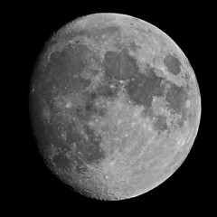
But I digress. The third image (bottom right) gets around the chromatic aberration by going monochrome — using only the red channel. Refractors’ chromatic aberration occurs because different colours have different focal points; since blue is the colour that has trouble reaching focus, going to just the red channel should get the sharpest image possible, I think. Besides, I like using single colour channels for black and white photography: it yields interesting results.
(You’ll have to click through to get a better look at these images; you won’t be able to tell very much from these thumbnails.)